Red and green are complementary colors; red is a primary color, while green is a secondary color that can be produced by mixing yellow and blue. When these two colors are combined, they create an entirely new color.
However, there are various accounts of what color red and green will produce, so it’s crucial to analyze the situation to determine the expected result.
Apart from red, the other primary colors are blue and yellow, while secondary colors include green, orange, and violet. Tertiary colors are created by mixing primary and secondary colors, and they include red-orange, yellow-orange, yellow-green, blue-green, blue-violet, and red-violet.
So, what color do red and green make? The combination of red and green produces yellow, but the intensity of either color can affect the result. In some cases, the final color may be a yellow-grey shade.
What Are the Different Methods of Color Mixing?

There exist two primary methods of color mixing, which are additive and subtractive color mixing.
1. The Additive Color Mixing
The additive color mixing process is used to create colors in electronic displays such as computer monitors, televisions, and mobile phones. It involves combining different colored lights to produce a new color.
Red, green, and blue are the primary colors used in additive color mixing, and they are often referred to as the RGB colors. The question that people often ask when it comes to additive color mixing is, what color does red and green make?
When red and green are combined, they produce yellow. This is because when red and green light are mixed, they activate both the red and green receptors in our eyes, which create the perception of yellow. The intensity of either color can affect the resulting shade of yellow.
Additive color mixing works by combining different amounts of light to produce new colors. For example, when red and blue light are combined, they produce magenta, while blue and green light produces cyan. When all three primary colors are combined in equal amounts, they produce white light.
Subtractive Color Mixing
Subtractive color mixing is the process of creating colors by mixing different pigments or dyes. This method is used in printing and painting, and it works by subtracting colors from white light to produce the desired hue. The primary colors used in subtractive color mixing are cyan, magenta, and yellow, which are often referred to as the CMY colors.
When red and green are mixed using subtractive color mixing, the resulting color will be closer to black or a dark shade of brown. This is because when red and green are combined, they subtract each other’s primary color wavelengths, resulting in a less saturated, darker hue.
However, the exact resulting color will depend on the intensity of each pigment and other factors such as lighting conditions and the color of the surface on which the mixture is applied.
The Different Color Wheels

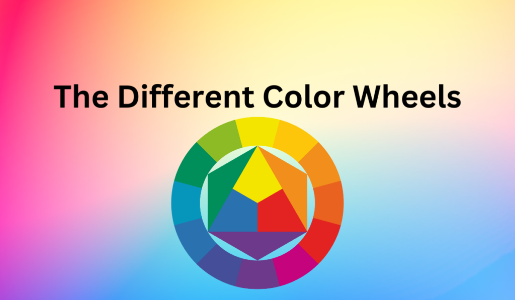
Color wheels are commonly utilized to distinguish between additive and subtractive methods of color mixing.
1. The RGB Color Wheel
The RGB color wheel is a visual representation of the primary colors used in additive color mixing. It consists of three primary colors: red, green, and blue. When these three colors are combined in varying intensities, they produce a wide range of colors that can be seen on electronic displays such as computer monitors, televisions, and mobile phones.
When red and green are mixed in the RGB color wheel, they produce yellow. The resulting shade of yellow can vary depending on the intensity of each color. For instance, if red is more intense than green, the resulting yellow will be closer to orange.
The RGB color wheel is an essential tool for designers, digital artists, and anyone who works with electronic displays. It allows them to create accurate color combinations and adjust the saturation and brightness of colors to achieve the desired effect.
2. The CMYK Color Wheels
The CMYK color wheel is a visual representation of the primary colors used in subtractive color mixing. It consists of four primary colors: cyan, magenta, yellow, and black (CMYK). Unlike the RGB color wheel, which produces colors by adding light, the CMYK color wheel produces colors by subtracting light.
When red and green are mixed using the CMYK color wheel, they produce a dark shade of brown or maroon. This is because the combination of red and green subtracts the cyan and yellow from the color spectrum, leaving only magenta and black. The resulting color will depend on the intensity of each pigment and the amount of black added to the mixture.
The CMYK color wheel is commonly used in the printing industry to create accurate color reproductions. Designers and print professionals use it to adjust the hue, saturation, and brightness of colors to produce high-quality prints.
Top of Form
What Are Complementing Colors?
Complementary colors are hues that are opposite to each other on the color wheel. When placed side by side, they create a strong contrast and enhance each other’s vibrancy, making them stand out. The complementary color pairs are red and green, blue and orange, and yellow and purple.
Complementary colors are frequently used in art, design, and fashion to create visually appealing color combinations. They provide a sense of balance and harmony, and can be used to highlight specific elements in a composition.
For example, a red object will appear more vibrant when placed against a green background, while a blue object will stand out when placed against an orange background.
In addition to their aesthetic value, complementary colors also have practical applications. They are used in color correction and color grading in photography and video editing to adjust the hue and color balance of an image or video.
Complementary colors can also be used to create color schemes for branding and marketing, as they can evoke specific emotions and associations.
What You Should Know About Color Schemes Or Harmony
Achieving color harmony involves manipulating the intensity of one or more colors in order to achieve a desired effect. To darken a color, you can create a shade by adding black or another dark color to the original color. This will lower the intensity of the color and create a darker hue.
Alternatively, you can darken a color by adding its complementary color, which is located on the opposite side of the color wheel. This technique will create a richer color than simply adding black. Some popular complementary color pairs include blue/orange, green/red, black/white, and yellow/purple.
The intensity of a color refers to its brightness or dullness. A bright, vibrant color has a high intensity, while a muted or dull color has a low intensity. Manipulating the intensity of colors is a key component of creating color harmony in art, design, and other visual mediums. By adjusting the intensity of colors, you can create a sense of balance and visual interest in your compositions.
1. Monochrome Harmony
Monochrome harmony is achieved by using a single color and its various shades, tints, and tones to create a cohesive and harmonious design. This color scheme is characterized by the use of a single hue, but with variations in its value, which refers to the lightness or darkness of the color.
One way to achieve a monochrome color scheme is by combining the chosen hue with neutral colors such as white, black, or gray. This creates a balanced and sophisticated design that is visually appealing.
2. Adjacent Color
Also called as Analogous color, is a color scheme that utilizes colors that are adjacent to each other on the color wheel. For example, colors like red and orange are considered analogous as they are neighboring colors.
By using analogous colors in a design, a sense of harmony and unity can be achieved while still allowing for variation and interest in the color palette. Analogous color schemes can be found in nature, as well as in art and design, and are often associated with a warm and inviting feeling.
Other examples of analogous color schemes include yellow, yellow-green, and green, or blue, blue-green, and green. By selecting a primary color and using its adjacent colors, designers can create a cohesive and visually pleasing color palette that can be used in a variety of design contexts.
3. Single Split Complement Color
A split-complementary color scheme is created by using a primary color and two colors adjacent to its complementary color on the color wheel. For example, a split-complementary color scheme can be created by using a primary color such as blue, along with colors adjacent to its complementary color of orange, such as yellow-orange and red-orange.
This color scheme allows for a wider range of colors to be used while still maintaining a sense of balance and harmony. A good example of a split-complementary color scheme can be found in various intensities of greens, which are paired with violet-reds and orange-reds.
4. A Triad
A triad color harmony, also known as a triadic color scheme, is a color combination that uses three colors that are equally spaced apart on the color wheel. This means that the colors are positioned at a distance of one-third of the wheel’s circumference from each other.
The three colors used in a triadic color scheme can be primary colors (red, yellow, and blue), secondary colors (orange, green, and purple), or tertiary colors (such as yellow-green, blue-violet, etc.).
Triadic color schemes can create a bold and vibrant color palette, and are often used in design and art to create visual interest and balance. When using a triadic color scheme, it’s important to balance the colors in a way that doesn’t overwhelm the eye, such as by using one dominant color and two accent colors, or by using shades and tints of the colors to create contrast and depth.
Conclusion
When it comes to mixing colors, they can be categorized as either warm or cool. Warm colors such as reds, yellows, and oranges tend to create high-intensity mixes that appear thicker and more vibrant.
Conversely, cool colors like blue, green, and violet tend to decrease the intensity of the final color in the mix. Neutral colors such as black, white, and grays also have a cooling effect on colors.
By using different color relationships, a variety of effects can be achieved. For example, a monochromatic scheme can be created using variations of a single color, while adjacent colors on the color wheel can be used in an analogous scheme.
A triadic color scheme uses three colors equally spaced around the color wheel, while a single or double split-complementary scheme uses a base color and the two colors adjacent to its complementary color. These color relationships offer different possibilities for creating unique and interesting color combinations.